Sunday, 8 February 2009

Lastly


In 1993, I was struck by the notion that there were just too many comicbook pages in existence (small-press or otherwise) to really justify my own contribution to the situation.

It seems that a lot can be done with a blank page or indeed very little. However, at the time I had scant appreciation for the storytelling subtlety of comics which often rely on several pages to convey the barest amount of visual information yet succeed in various other ways.


So I began a 6-page story and that many years later this got done: http://thebreakfastclubzine.blogspot.co.uk/2009/02/ray-of-light-comic-strip.html (It wasn't exactly a page per year; in fact the second was a weekend "rush job" but for the most part, I kept the visual content as demanding as possible and neither ink nor tone were added until every pencil line was as near to where it should be within my own particular realm of ability.)


It's just one approach, obviously, but the process of basking in an absence of editorial constraint or commercial deadline at least ensures that the creator can be all but satisfied with his or her own artwork.


The above panel is a particular favourite in the sense that it steps over the threshold of taking a character beyond her native genre (in a strange, bootleg type of way) from film to comic strip. Throughout the extrapolation every portrayal of the character is from an original (unfilmed) angle and the sequence itself stems from minor clues to her life beyond the single-set location of the "Shermer High School" library; as scattered about John Hughes' screenplay and related pictures.


Whereas the surrealism provided an opportunity to explore the 'comedy chain' which Hughes probably perfected in his first two Home Alone films!


'Ray of Light' appeared in a somewhat belated Breakfast Club fanzine which proved unable to surf the first or any subsequent wave of affection for some things '80's. It's now on-line and continues where this blog can proceed no further. After that there's a cul-de-sac which either takes you back to 'Artistic dabblings' or off to co-artist Tony Wright's drastically overdue but thankfully imminent webside debut with a selection of meticulously painted 2000ad characters of the 'classic' era.


Well, I suppose that's it! When I began this blog I could barely contemplate lifting a pencil towards a page of artwork-yet-to-be. Now I can't wait to cease this jabbering and get drawing again; so the 're-programming' process seems to have rescued this. . . artist. . . yes, I remember now - from a relentless rut!

I can only recommend the ritual to anyone who may similarly find themselves in a creatively moribund position.

So thanks for your choice of visual leisure and the share of your focus on a borderline narcissistic stock-take of stuff which at least deserves to be out of its dingy cupboard!
It's my utmost hope that anyone with infinitely better material which may have been languishing in some loft since Editor X, Y or Z dismissed their efforts in favour of whatever curiously lesser freelancers were on the scene (it happens) will share some of their proudest moments because we all need that sharp sense of distant awe the moment that satisfaction begins to seduce creativity.

Till next time or other,

John

PS 2014 I rather realised I prefer writing these days: http://www.wattpad.com/user/dandydilettante

Thursday, 5 February 2009

'Frankly Feendish' (1992)


For a while, I considered submitting stuff to Buster (last of the legendary line of Fleetway juvenile titles) with a view to getting a spot of occasional colourwork.

It only got as far as the first (A2) page of the proposal and never received the gloomy wash which was envisaged - a bit of a shame really because I felt that the plot had something going for it but I just couldn't take the plunge back into cartooning.


The storyline comprised a sequel to the episodes in Whoopee which had seen the trashing of 'Mildew Manor' on a weekly basis for over a decade, as far as I could recall. It seemed as though enough was enough, so that plug and chain became both a souvenir for Frankie Stein and a reminder from Professor Cube of all that remained of the place while the pair headed towards a suitably cliche-ridden alternative residence for a slightly different scenario.


Cube's scheme was to capitalise on the only attribute that our lovable lunk seemed to exude by affording him an unbridled opportunity to wreck havoc for the amusement of obnoxious tourists (affluent Americans, obviously) who would become central to the catastrophe having already subscribed to a night in a 'Haunted Castle'.
So when everything had gone arbitrarily pear-shaped in the course of 3 pages and Frankie crashes through a few floors, ending up in a basement surrounded by hundreds of half-drunk barrels of wine; so enters an exceedingly drunk Grimly Feendish!
It was all some sort of allegory about the state of the British comics industry where two of its finest characters have the last laugh. Maybe someone with cartoony credentials could make it happen someday!

Wednesday, 4 February 2009

A different type of Artschool...


(Roughly translated: "You've a long way to go mate!")


I took a time-out from drawing for a year or so whilst captivated by ninja lore.

At a purely physical level, the 'Bujinkan' system is quite well suited to those of us with a creative rather than mathematical mindset because the central concept stems from awareness of 'nagare' or flow from one instant to the next. So instead of responding to "Attack B" with "Defence C" - the techniques meld into the subconscious self in the way that anyone who can type or drive a car will be aware of and soon you can chat about football while someone is trying to cut your throat or whatever.

Well, maybe not! And even 'mastery' is no guarantee of safety but it's worth a taster or more to develop confidence and a supple physique; so they say.


By 1992, I'd taken up circuit training instead because even minor gymnastics get the better of me; to say nothing of the Japanese terminology and seemingly encyclopedic knowledge of technique that became somewhat difficult to integrate while learning carpentry.

Maybe when there's another decent clearance in all the clutter. . .

Back then though the drawing board was calling me back and eventually the pangs became more brutal than some of the classes!

Tuesday, 3 February 2009

'A Moment of Glory'


That was the title, anyway - the artwork was nothing of the sort although the first of the five pages (from where most of these panels are taken) managed to meet the demands of a superb script by Andy Nixon.

About a year after leaving Art College and training to be a carpenter; I got in contact with the editor of Angeldust - an ambitious small-press title which was based in Cardiff. Andy afforded me his best script about a (pre-Dunblane) schoolyard shooting. However, I made an outright hash of the artwork despite there being several months between the first and final panels.

Shortly after starting the strip, I got into ninjutsu which required an inescapable amount of dedication to become anything better than hopeless alongside blokes that typically began martial arts training in childhood.

I had hoped that a handful of half-decent panels would cart the strip along but the cynical strategy backfired only to enhance the dismaldom of the remaining dross. Meanwhile, Angeldust was attracting high-quality submissions and Andy (also an illustrator) was left with little option but to bounce my duff rendition of 'A Moment of Glory' from the anthology.

There followed a few witheringly satirical exchanges between us but put it this way; there's no way that the art is going on this blog! So, I guess you had the more sensible outlook at the time, Andy.

At least the experience imparted a realisation that I was unable to produce satisfactory artwork within the remotest deadline and it was also a visual turning point in that the style was 'clear-line' throughout. In that respect, I have a College tutor to thank for emphasising the integrity of line to convey information when it's often tempting to obfuscate an image with what Brian Bolland has similarly referred to as 'twiddly-noodling' - or superfluous inking habits.

It's also clear that a few of the construction details on the shed would easily antagonise the average site foreman, if implemented, although I don't suppose there are many comix enthusiasts who have to worry about that particular scenario!

Monday, 2 February 2009

Christmas project ('88)


There were other more appropriate words to convey the tradition (as I saw it) including gluttony; avarice, overdrawn and hangover among various improvisations from turkey bones, or whatever.

This is the only photo left over from the caper but it's really a misshapen Humbug!

Hare


Thursday, 29 January 2009

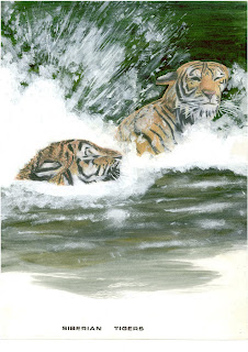
Siberian tigers


(charcoal pencils/acrylics)


This particular departure from the coursework captured a surge of inspiration, bestowed, during an outing to a major design exhibition at Earl's Court, or more precisely; from watching a demonstration of charcoal pencils by top-class illustrator, Colin Bradley.

If you like the above and want to see how it's really done visit:

http://www.bradleygallery.co.uk/